The Psychology of Color in Fitness Branding | Build a Stronger Brand Identity
Why Color Psychology Matters in Fitness Branding
Ever wonder why so many fitness brands lean on bold reds, electric blues, or vibrant greens?
It’s not a coincidence—it’s strategy.
Color doesn’t just make your brand look good. It makes people feel something.
In the competitive world of fitness, where energy, motivation, and trust drive client decisions, your color palette can literally influence how your audience perceives your brand before they read a single word.
Whether you’re a personal trainer building your brand or a coach teaching others how to do it, understanding color psychology gives you a design edge that goes beyond aesthetics—it builds emotional connection.
🔴 Red: Energy, Power, and Action
Red is the color of motion, adrenaline, and intensity.
That’s why it dominates brands like CrossFit, Peloton, and Nike.
Use red when you want your brand to feel:
- Bold, passionate, and driven
- Focused on performance and challenge
- Motivational or competitive
⚠️ Caution: Too much red can come across as aggressive or overwhelming. Balance it with neutral tones (like black, gray, or white) to keep the look professional.
🔵 Blue: Trust, Stability, and Loyalty
Blue evokes calm, dependability, and professionalism—perfect for brands that emphasize coaching, longevity, and results.
You’ll find blue in health and tech-driven fitness brands that want to signal science, structure, and trust.
Use blue if your brand message is:
- Evidence-based or data-driven
- Focused on recovery, discipline, or long-term growth
- More coach than cheerleader
💡 Pro tip: Darker blues convey authority, while lighter blues feel refreshing and supportive.
🟢 Green: Health, Growth, and Balance
Green symbolizes renewal and progress. It’s the color of nature, nutrition, and positive transformation—making it perfect for holistic trainers, wellness coaches, or brands emphasizing balance over burnout.
Use green when your message revolves around:
- Sustainable health and lifestyle change
- Mind-body connection
- Community and growth
Combine green with neutrals like white or soft gray for a clean, modern feel.
🟣 Purple: Creativity and Transformation
Purple bridges the gap between red’s intensity and blue’s calm. It’s often associated with transformation, making it ideal for coaches focused on mindset, motivation, or personal evolution.
Use purple if your coaching brand leans into:
- Emotional intelligence or mental fitness
- High-end or boutique services
- Empowerment and personal reinvention
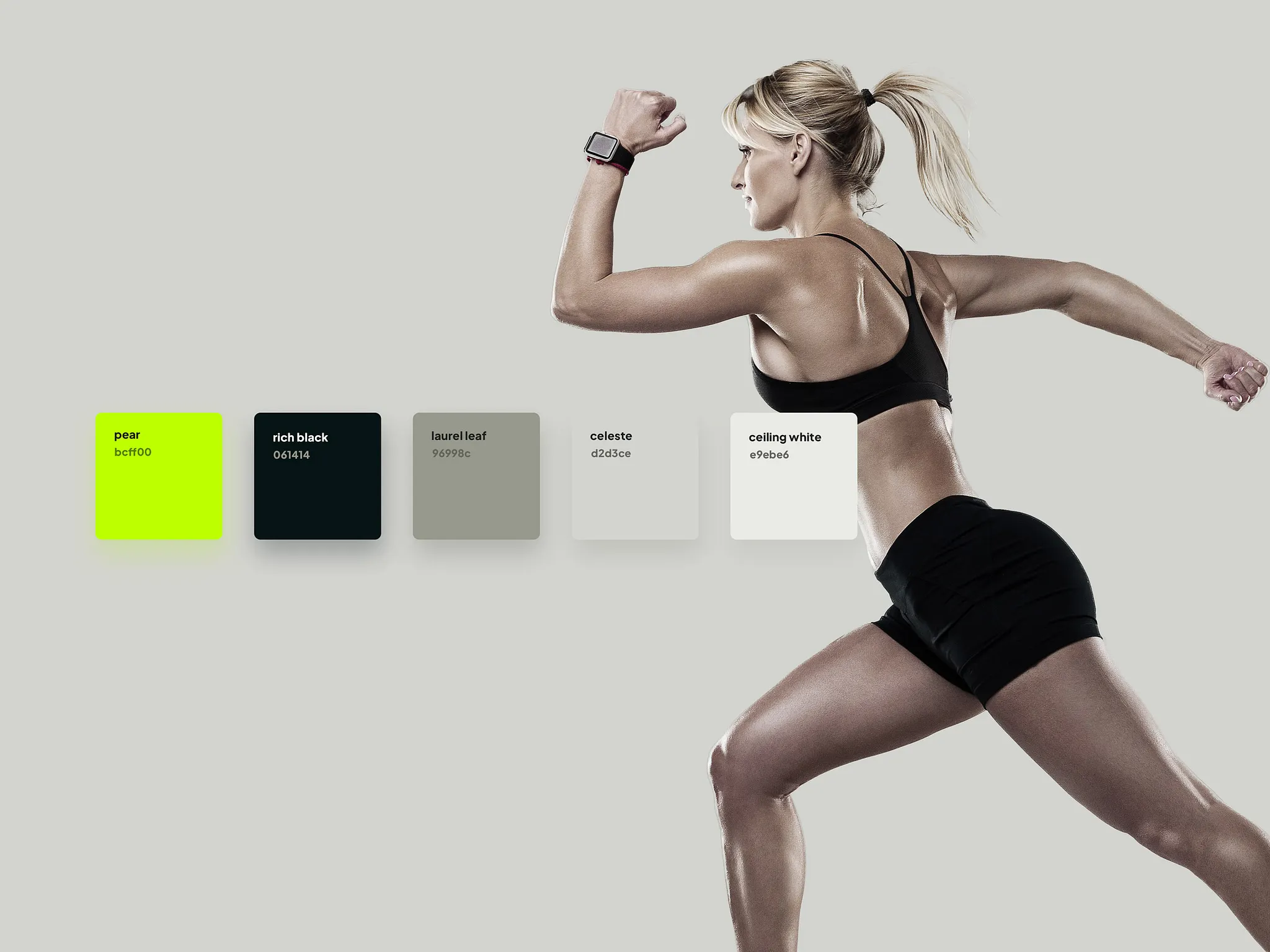
⚫ Black, White, and Neutrals: The Power of Simplicity
Black conveys sophistication and control. White adds space, clarity, and purity.
Together—or with shades of gray—they serve as your brand’s visual breathing room.
Use them to:
- Create contrast with stronger colors
- Signal confidence and professionalism
- Keep your design timeless and versatile
Think of these as your brand anchors—they let your accent colors shine without overwhelming your audience.
💡 How to Choose Your Fitness Brand Colors
Here’s a simple framework for trainers and coaches refining their visual identity:
- Define Your Core Emotion
What should clients feel when they see your brand? (Motivated, supported, inspired, challenged?) - Pick a Primary Color
Choose one color that aligns with that emotion. - Add a Supporting Palette
Include 1–2 accent colors and 1–2 neutrals to balance the design. - Stay Consistent Everywhere
Use your palette across your logo, website, social media, and client materials. Consistency builds recognition and trust.
🧩 Real-World Example
A strength coach might use red + black for intensity and confidence.
A mindset or lifestyle coach might use green + beige for calm, supportive energy.
A performance consultant could use blue + silver for professionalism and trust.
Each combination tells a different story—choose yours intentionally.
🚀 Final Thoughts: Color Is Your Silent Coach
Every color speaks before your words do.
When your visuals align with your brand’s voice, your message becomes magnetic.
So before you pick your next logo color or website theme, ask yourself:
“What do I want my clients to feel?”
That answer is the foundation of your fitness brand identity.
Related Posts
Should You Train When You Don’t Feel Like It? A Coach’s Honest Answer
The Question Every Lifter Eventually Faces Have you ever stood in your gym clothes, staring at the clock, hoping motivation
How Long Does It Really Take to Build a Fitness Habit?
How long does it take to build a fitness habit? Learn the real timeline, common mistakes, and proven strategies to stay consistent long term.